Role
Lead UX / Art Director
Lead UX / Art Director
Magsty is a brilliant magazine CMS solution for publishers and readers, but was considered by investors just as another blog service.
We worked to unify, simplify, and amplify the reading experience and the functionalities of the service. After researching, wireframing, designing, and prototyping, we designed an intuitive, classy, and user-friendly product awarded by the community.
Sector / Type
Editorial / Web app / Redesign
UX Focus
Reading on a screen, Optimal Line Length, User Engagement
Engaging readers
Across multiple screens and devices
SpeckyBoy Magazine
Weekly Web & Mobile Creativity #22
Awwwards
Nominee for the best landing page
US local market
New York
Screen-based behavior is characterized by more time spent on browsing and scanning, keyword spotting, one-time non-linear reading, and selective reading rather than in-depth and concentrated reading.

Displaying article full width requires more physical and cognitive effort from the reader, and increases bouncing rate at the cost of deep understanding of content. In fact, the longer the line, the greater the eye movements, pauses, and skimming.

Competitors adopted proprietary solutions, based on mobile operating systems. However, magazines often remain a mere PDF version of the paper edition, limiting any possible interaction.

All competitors are displaying content on computers, tablets and smartphones. However, it does not translate into a mobile enhanced reading experience and features. Only 2 competitors have a readibility module, and only one owns a in-search algorythm. No one lets the user play with the content: no copying and pasting, no highlighting, and no dictionary. Still in 2016, no one is open to social interaction with the authors: users can like the magazines, but neither follow, or comment as they would do on the web. 60% of them advertise the possibilty to create your own content, but it is entangled into a proprietary solution. All of them are reaching out to a mobile-based readership, instead of reaching out to a global community of readers.

Writes in early mornings, alone, at home, and spends the rest of the day reviewing what is happening in her field, or she spends time with her children.
Logs in, writes articles in the in-house CMS and send them to review.
A CMS for focusing on writing only without having to deal with coding aspects.
How can I change the layout of my article, or add picture galleries?

Works at a small publishing company. He spends his day reading and reviewing articles, and making revisions. He manages a team of in-house and freelance journalists.
Logs into CMS and email to review submissions, into CMS and email to review submissions.
A CMS for gathering all information and managing the release of current issues.
At what date did you send me that information by email?

Spends his days reading articles in his field, and his nights scrutinizing the sky...when he is not partying or playing Call of Duty.
Connects to multiple sites to read articles and copying and pasting to another software.
A tool for copying/pasting every interesting data, following authors, also commenting.
In what article did I read that? Who wrote that, again?


Studies show that passive are better for long visual focus and deep reading on a screen. That is the reason why we chose them to display content. To contrast, we used active colors to let the functions stand out. Different color schemes were also created to help editors to design their magazine.

Creating a magazine CMS in the ever changing width of our displays, requires flexibility and freedom. 16 and 18 column grids are available to match the layout of the publishers. To differ from responsive web design, we strongly recommended not to design a fluid grid, but to reorganize the content depending the available width.

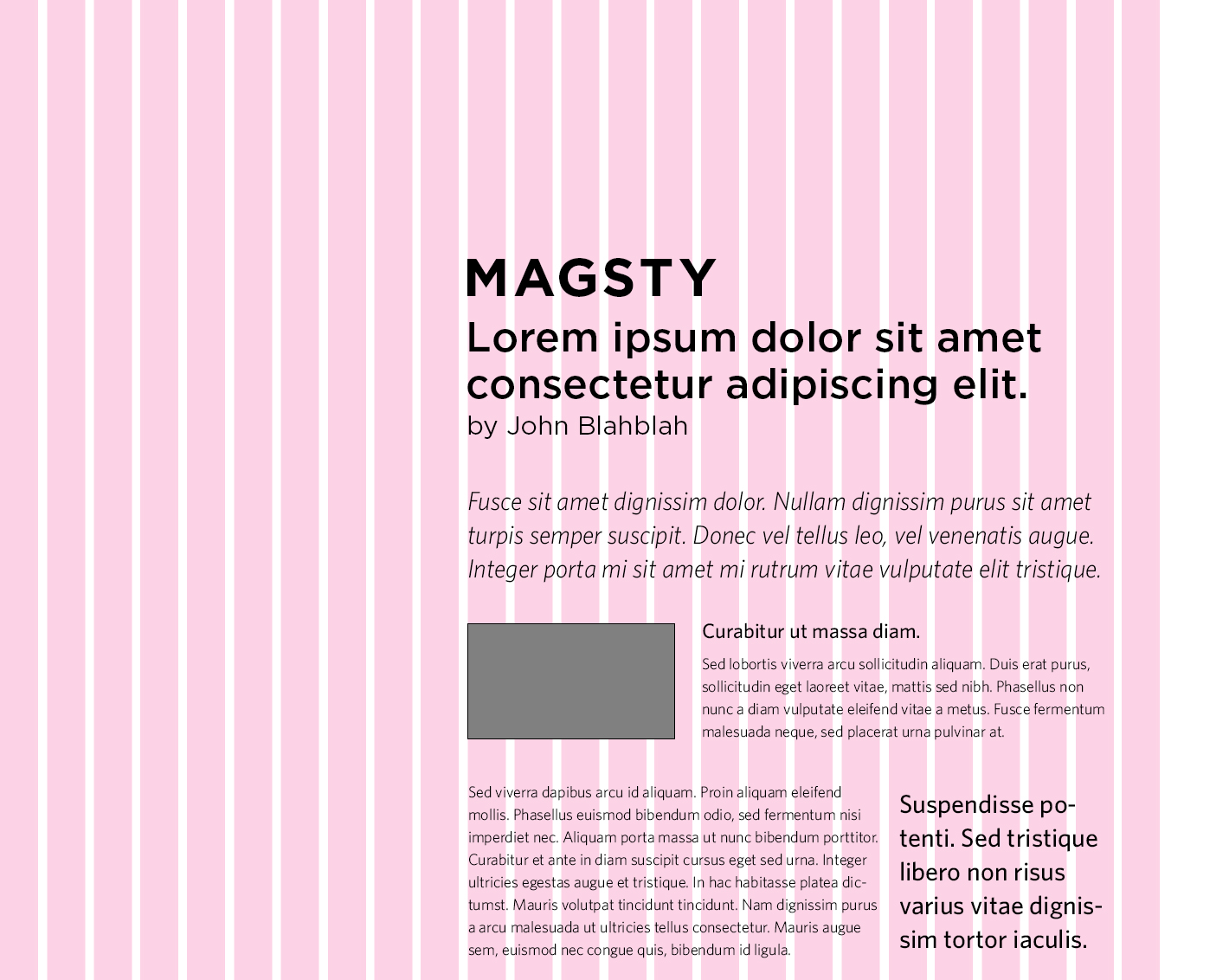
Lucas Sequence ratio and Optimal Line Length theory creates an instant vertical hierarchy that enhances readability; It respects cognitive needs: perception of recognizable chunks of information, and consolidation of overall comprehension via reduced amount of eye movements.
In order to help editors design with poise, we created font stacks along with color schemes. The CMS, taking advantage of the Hoeffler & Frere Jones Typography Cloud, relieves editors from paying and hosting a font license. We also decided to dust away the old rectangur header image by changing the way we display images. For example, we used SVG Masks to give editors the same creativity they have with the paper edition.

From a pure user experience point of view, the same content should be enhanced rather than being displayed the same way across devices. Responsive web design does not take work environment into account. Therefore, eye fatigue, light reflection, ambiant noise around, mobility, are issues that are not addressed. We imagined ways to enhance readability, and make content accessible whatever orientation, or environment the user is into.


